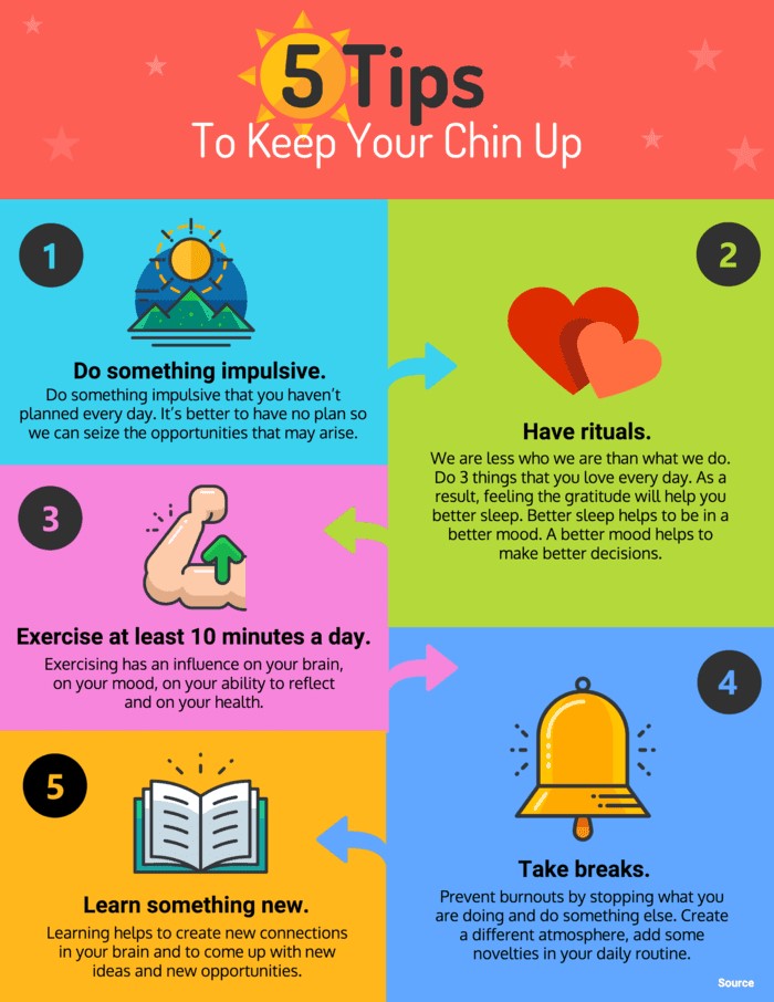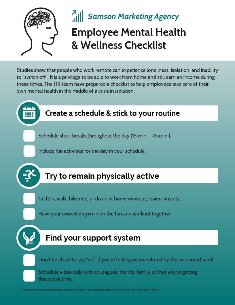
Mental health is a person’s state of well-being. It is an important aspect of a person’s life. Nowadays, the word “mental health” is still considered as an elephant in the room. It’s a hard thing to talk about but an important subject to discuss.
Fortunately, many organizations are working hard to spread awareness. Informing people that it’s okay and that there are many people across the world who are very much willing to help. With the aid of technology and the internet, we can now spread insightful knowledge and raise awareness effectively and creatively. Infographics is a compelling and smart way of presenting data and information through visual representation. Websites like Venngage can help you by providing thousands of infographic templates for free.
As we go along, we will help you create insightful mental health infographics.
Why use infographics?

Infographics is an art form. It helps us deliver important information and/or messages across the world in an interesting and easy-to-understand visual context. With the use of colorful diagrams and images, it is a creative way to convey a serious subject and at the same time still send a powerful message.
5 Tips on Creating a Powerful Mental Health Awareness Infographic
Here are five usefulful tips on how to create a powerful and meaningful infographic for mental health awareness.
Research
Every presentation needs extensive research. As someone who provides information and/or spreads awareness, you are responsible for every data and knowledge you share. Your data should be relative and recent. Conducting surveys can also be helpful for demographic statistics.
Write catchy headlines.
Get people to read your infographic by incorporating emotionally catching phrases. Headlines are the first few words that people notice; it can either make or break your content. You can use powerful and thought-provoking questions to make your potential readers wonder, use numbers from your research to catch their attention, or create a mind-stopping statement that could make them drop whatever it is they are doing and dedicate their undivided attention to your infographic.
Words, when used right, can create a powerful bridge towards your readers’ hearts. Make them feel your presence and concern by putting your emotions on your output.
Incorporate the right colors.
A green ribbon represents mental health awareness month. You can also use and mix up different colors to help get your message across. For example, the color blue can give a calm and peaceful mood, the color yellow gives off a positive and happy vibe, red represents passion, purple promotes spirituality, and the color pink represents compassion.
Also, you need to be careful in mixing colors as you don’t want a chaotic and stressful output. When in hesitation, you can always use a color chart to determine complementary colors. For an effective mental health awareness infographic, using analogous colors is a good choice. Analogous colors give off a calming and ambient vibe.
Do not use too many colors for your design. As much as possible, keep a white space where you can place and display all important images, diagrams and information. Color psychology is important in every visual presentation, you can search up color psychology tips and advice online to help you.
Use the right fonts.
Fonts also give off certain moods in your design. Using the wrong kind of font could make your output look dull and poorly made. Just like headlines, a font can also make or break your infographic design. Another reminder — use only two to three fonts. Using more than three can make your layout look messy.
Here’s a list of fonts you can use for headings:
- Coldiac
- Media Times
- Chillow
- San Serif
- Gemosh
Here’s another list of fonts you can use for body text:
- Helvetica
- Franklin Gothic
- Calibri
- Arial
- Malgum Gothic
Keep it simple.
Keep your design neat and simple. It makes your readers’ eyes stress-free and relaxed. Putting too many images, colors, fonts and extra details creates a busy infographic, causing your viewer’s attention to be fragmented.
Be sincere.
You are trying to spread awareness about an important matter. Your audience needs to feel your sincerity and concern. Create a bond using your words. There’s nothing more effective than making your audience feel that they are important and that they matter. Remember, you are making an infographic not for yourself but for them.
Now that you have learned all the essential tips on making an infographic, all you have to do is look for a great infographic maker that can guide you every step of the way.
Mental health is indeed a sensitive matter to talk about and a lot of people need more knowledge and awareness to help their friends and loved ones. As human beings, we are wired to help people who are in need. If we can reach out and lend a hand in spreading awareness by making powerful and moving infographics, then let’s start now.

